Why and How to Use an Excel Trips Log to Journal All of Your Travels in One Place
- Garrett Busch
- Jul 12, 2024
- 8 min read

Updated: Jul 13, 2024

Let's First Start Out with What is a Trips Log?
In all of our itinerary posts you will see a downloadable link to a Trips Log Microsoft Excel sheet. You can think of this as a database of all your travels, as well as a journal all in one. We first started doing a trips log after one of our journals from our honeymoon got soaking wet and thus illegible. We thought about what an easy way would be to keep this information electronically safe and in a fun format where we could then create our own stat sheets of our travels. We now only use a trips log for all of our journaling and as a master database and found it as a superior way to track where we go and what we do.
Another benefit of the Trips Log is that it helps you remember where you went and you can easily have a version that you can pull up to show family and friends if they have a question where something was. There are now areas we have traveled to multiple times over the last decade or so and we continually pull up our log in Excel or Google Maps to see exactly what breweries, vineyards, or hikes we have already done in that area to see maybe what we rated as the best to repeat or what we might want to avoid to do something new.
Why Should You Use a Trips Log in Excel, especially instead of Google?
I know initially many of the more tech savvy readers will simply state, you could do the same thing in Google Maps by categorizing and saving pins. Yes and No. Yes, if you go into Google Maps you can begin pinning locations tied to your Google Account by clicking on the "Saved" tab on the far-left side of the screen, looking up locations in the Search Bar and clicking the Save button under the location.

Above would be Saving an individual location. Below is what it would look like if you pulled up your Saved Map on your Google Account to see all of the places you have Saved.
We do use Google to Save places that we want to go to. However, when it comes to trips we have already done, Google is very limited in what it will allow you to enter as far as notes go, how it will let you categorize the data, and the biggest downside to us if, what happens if you ever lose your Google Account? Or you want to use another service? Then all of your data is tied up with Google and it is incredibly difficult to retrieve.

Instead, we like to use Microsoft Excel. Your data is much safer, you can save multiple backups easily, it is easier to update, and you can transfer your data to any service or simply keep it in Excel as the possibilities for viewing this data here are endless.
Second, when you upload your Excel sheet into Google you can then filter and categorize your data in many more ways and all on one page. If you are only using your Google Account, Google will make you separate the different categories of your maps into different sheets so that you can't view them all together. When you upload into Google Maps using an Excel file, you can view up to 2,000 data points all on one map, again with endless ways to categorize and color code the data/pins.
Finally, if you keep a Trips Log going for long enough you will eventually run into a limit with Google where they will only allow you to have 2,000 unique data points on a single map. In Excel, you can have up to 1,048,576 unique data points, which would be quite hard to go over even in a lifetime of travels.
How to Use a Trips Log:
I will show you a few ways we use both Excel and Google Maps to analyze our Trips Log data.
For Excel, we mainly utilize Pivot Tables to create a variety of different views to track what we've done. Using the exact template we provide on our itineraries here are some of the views we regularly look at:
Miles Hiked Per Month by Year -

Miles Hiked per State/Country, and Vertical Feet Hiked/Climbed by State in the US -

Count of Activities by Type, Attractions Visited by Country, and How Hard/Steep a Hiking/Climbing Day was based on the YDS Grade -

Some other ideas would be sorting the Activities done by City/Park, you can look at the average length of your hikes by state or park, you could look at the type of features you have gone to see the most (downtowns, museums, waterfalls, peaks, beaches, etc.).
You can also create any kind of graph based on these pivot tables to go along with your data as in the first screenshot.
Here are some screenshots on how to pull your data into a Pivot Table and how to use a Pivot Table:
Select the "Insert" Tab at the top left of the Excel File.
Hit the "PivotTable" Option at the top left of the ribbon.

3. Create PivotTable will then pop up, it should default to "New Worksheet" as the option which will then pull up the piot table into a new worksheet, rather than somewhere else on the current sheet.
4. Select "OK"

5. Below is the sheet you will now see. A Pivot Table template will appear and so will the "Field List" to the right-hand side of the screen.

6. Below is an example of some of the functionality. To select a data type to pivot on, select the item in the "PivotTable Fields" Table on the far right and click on the category then drag it into 1 of the 4 boxes: Filters, Columns, Rows, and Values. As a general rule your table will be easier to read if you have more rows than columns. I chose to drag my Month data into my rows and then my Rating by each item into the Columns, then I selected my own Rating (Rating G) which is on a scale of 1-10 what I rated the attraction and put that in the Values section. This table is now going to show you the Count of the number of each rating (1-10) that I rated an attraction that we visited during the month in that corresponding row.
7. You can right click on the row or value and Sort this data by A-Z or if you right clicked on a data point in your Grand Total Column you could sort by Largest to Smallest or vice versa.

8. To change the values from Count (counting the data points), to Sum (adding the data points), or Average (averaging all the data points), Click the Down Arrow on the row in the "Values" section and select "Value Field Settings".

9. Next Select the Summarized Value Field By setting, either Sum, Count, or Average would be my most used although there are more advanced options. You can also change the Name of the Column or Data Point in the "Custom Name" bar.

10. Finally, if you want to insert a graph from the PivotTable data you can navigate to the "PivotTable Analyze" tab at the top middle of the screen. This tab will help with anything you want to change or edit on your pivot table from an Options standpoint. If you want to refresh your data here, select the "Refresh" button. If your table changes with your original data in your Trips Log, you can select the "Change Data Source" button to then select more or less data. To create a graph with your PivotTable data select the "PivotChart" option in the far-right side of the ribbon at the top of the screen. Next the "Insert Chart" function will pop up and you can select the type of graph you'd like.

How to Use a Trips Log File in Google Maps:
To view all of your data points and categorize them in Google first open Google Maps and then click the "Saved" button on the left side of the screen.

With the Saved tab open, click the "Maps" option and then "Open My Maps". If you already have a map saved you will see it under the "Open My Maps" option like mine below from July 1, 2024.

This will open a new screen and you will then click "Create A New map", then another prompt will open and click "Create".

A new screen will open once again, click the "Import" button under the Untitled Layer, then click Browse and select the Trips Log file you would like to import.

Next, you will be prompted by two different screens that will help you organize your map. For the Choose Columns to position your placemarks you will select "Location" and then the way Google Maps and I organize lat/long is with Latitude first, so select the bottom option. For the Choose a column to title your markers page, this is entirely up to you. How would you like your data color coded in Google Maps? You can do it by Year to see where you've been differentiated each year or by Trip if you name them separately, I usually choose by Activity as my favorite.


When the map first comes up you will see that every data point is the same colo. To change this click on the "Uniform Style" button.
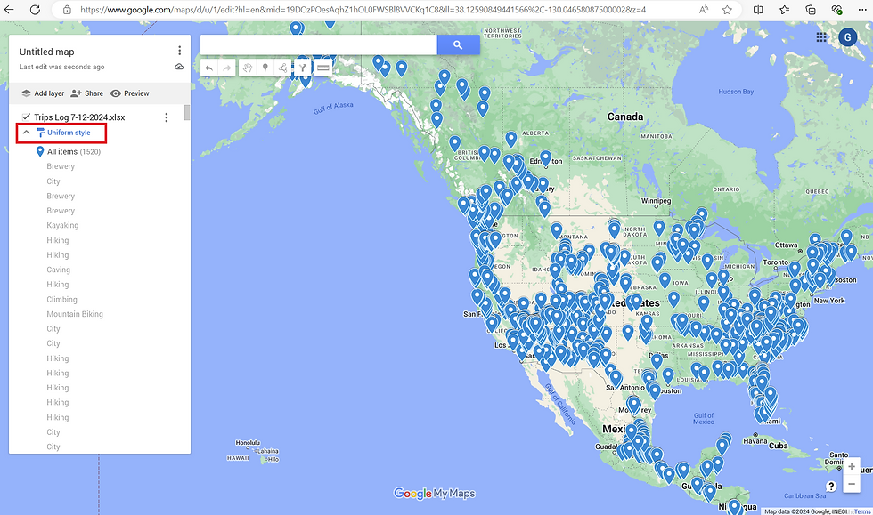
A drop-down prompt will open on top of this select "Uniform Style" under the Group Place By.

Finally, select the category you want to color code, this will be same category you chose in the Choose a column to title your markers page. then your map will be illuminated with colorful pins and you can change the different colors of each one you want.

Once the map loads, be sure to click the up "^" next to "Styled by Activity" this will bring the drop down from every individual data point up to the group summary. You can then select any category group and Google will highlight it on the map, in this example I have selected all the places we have Climbed to highlight on the map. The end result will look like this:

Now you have an on the go version of your excel file on Google Maps that you can pull up on your computer or phone to show any of your friends and family or to look for yourself. You can click on any of the categories or if you click on a pin individually it will bring up all of your data from the Excel sheet.

To Begin Using Our Pre-Load Trips Log Templates:
If you were to click on one of our downloadable Trips Log Files in one of our itineraries it will pull up an excel spreadsheet with all of the details of that trip including:
The Name of the Trip
The specific Activity done
The main Feature of that Activity
The Latitude/Longitude of the location
The Name of the Activity
If it is a Hike the Distance in Miles hiked
If it is a hike/climb the Vertical Gain in feet of the hike/climb
The YDS or Yosemite Decimal System that grades the difficulty of that hike/climb
The City/Park where the Activity is location
The State of the Activity
The Country of that Activity
There are then a series of blank Columns where you can add in your customized information that fits your trip. This includes the Date, Month, and Year you did each Activity, Notes about the Activity (think of this as a journal, things you want to remember), and your Rating of the Activity (we use a scale of 1-10, 1 was terrible we would not do again, 10 is the best of the best). If you want to add more attractions or different attractions the only real data point you will need to gather is the latitude/longitude. This is easily done by going to Google Maps, searching your attraction or hike, then when it pulls up simply click anywhere close to the pin and at the bottom center of the page a latitude and longitude will pull up. We then just copy and paste this into our excel file. Latitude/longitude works better than the location name because sometimes, especially if it is a business such as a brewery, vineyard, or attraction the name can change.

We like to provide the template and the starting ground for your trip to make the planning and tracking of your travel easy. You can use the sheets we provide as a template and customize it as you see fit by adding or deleting rows or rearranging the data.
It is been a blast to track our travels and has become a fun convenient way to look at the analytics ourselves and to share them with other people. We hope you find this useful and incorporate this to track your own travels.
Comments